
Caro Buck: Data Wizard
Hi! I’m Caro, short for Caroline. I’m a curious and creative human, with a passion for data of all sorts. I love wrangling unconventional data or using a visualization to foster understanding and promote data literacy. I’m a pro at building backend data apps, write some mean documentation, and am learning frontend.
I have worked on a wide variety of client projects, from AI-generated graffiti and time series modeling, to advanced analytics and data visualization. I thrive in environments where curiosity, creativity and rabbit holes are encouraged.
In my free time, you’ll find me swimming, sailing, swing dancing, or leading a tour around downtown Boston – come along for a stroll to be inundated with fun facts!
Relevant skills & hobbies
- Wrangle data, build APIs, write documentation, create data visualizations
- R (advanced), Python (advanced), Javascript (intermediate), SQL (intermediate)
- Tutor data & math of many flavors (calculus, statistics, algebra, oh my!)
- Lead tours around downtown Boston (advanced)
- Swirl around on the dance floor: swing (advanced), salsa (beginner)
- Whip up a fiber arts project: crochet (advanced), knit (intermediate)
Using data and technology to bring people together
I firmly believe in the beauty of rabbit holes, the necessity of creative problem solving, and the power of data and technology to build community. Data are all around us – and if we allow it, we can use data to learn about ourselves, others, and the world in unexpected and wonderful ways. Good community is essential for human well-being; these pieces demonstrate some of the work I’ve done to create more spaces for flourishing.

The Benefit of Talking to the “Non-Datas”
- I’m passionate about good data visualization and expanding data literacy. With the rise in AI, how can we expect people to thrive unless we take our data seriously?
- As a data practitioner, I see it as my responsibility to steward my data skills with enthusiasm, wisdom, and creativity. This talk, given at rstudio::conf(2022), is both a celebration and an awareness piece.
- Data parties are conversations about data that meet people where they are. The goal of these conversations is to build common ground, ask questions and make space to be curious about our world, together.
- Skills & tools used: Public speaking, data literacy, community networking, Quarto
- Video recording & slides
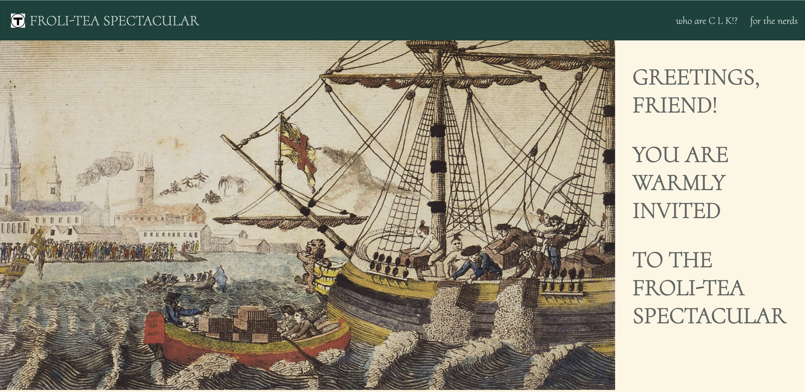
Froli-Tea Spectacular
- Parties are a way to bring people together from different backgrounds and groups, and I bring this collaborative energy into all aspects of my life. I love celebrating things big and small, especially when there is a theme involved and a high likelihood for a good group photo.
- Sure, yes, building a bespoke website is overkill for a party invitation, yet the surprise and delight of going above and beyond what’s merely necessary is worth it.
- Skills & tools used: Quarto, web development
- See the invitation

Caro’s 2022 Recap
- Big tech companies are usually the main benefactors of “big data.” I decided to take back some of the power – by getting personal benefit from big tech’s data collection.
- Using location data collected via my phone, I tracked and analyzed everywhere I went in 2022. As a homage to the adventures, stories, and people that filled my year, I visualized the data in an unconventional map.
- Skills & tools used: Data wrangling, visualization, storytelling, R, ggplot2
- See the recap visualization
Quirky & Unconventional data visualization
Data – big and small – can teach us a lot if we’re willing to pay attention. One way to boost data literacy is to collect, visualize, and share unexpected data. It’s fun to be curious, see what can be learned, and break a few “rules” of data visualization along the way.


- A personal data collection project, where I manually tracked every time I laughed in a week.
- I learned I have several distinct “laugh styles” & I used the data collected to remember small moments of joy in an otherwise challenging week.
- Visualization is hand-drawn using colored pencils.
- See the laugh chart
- Inspired by data portraits created by Giorgia Lupi, I surveyed my coworkers and created unique badges for the team.
- The project built camaraderie in the early days of working remotely due to Covid-19, and inspired other teams at the agency to include data practitioners in more projects.
- Visualization is hand-drawn using Procreate.
- See the portraits
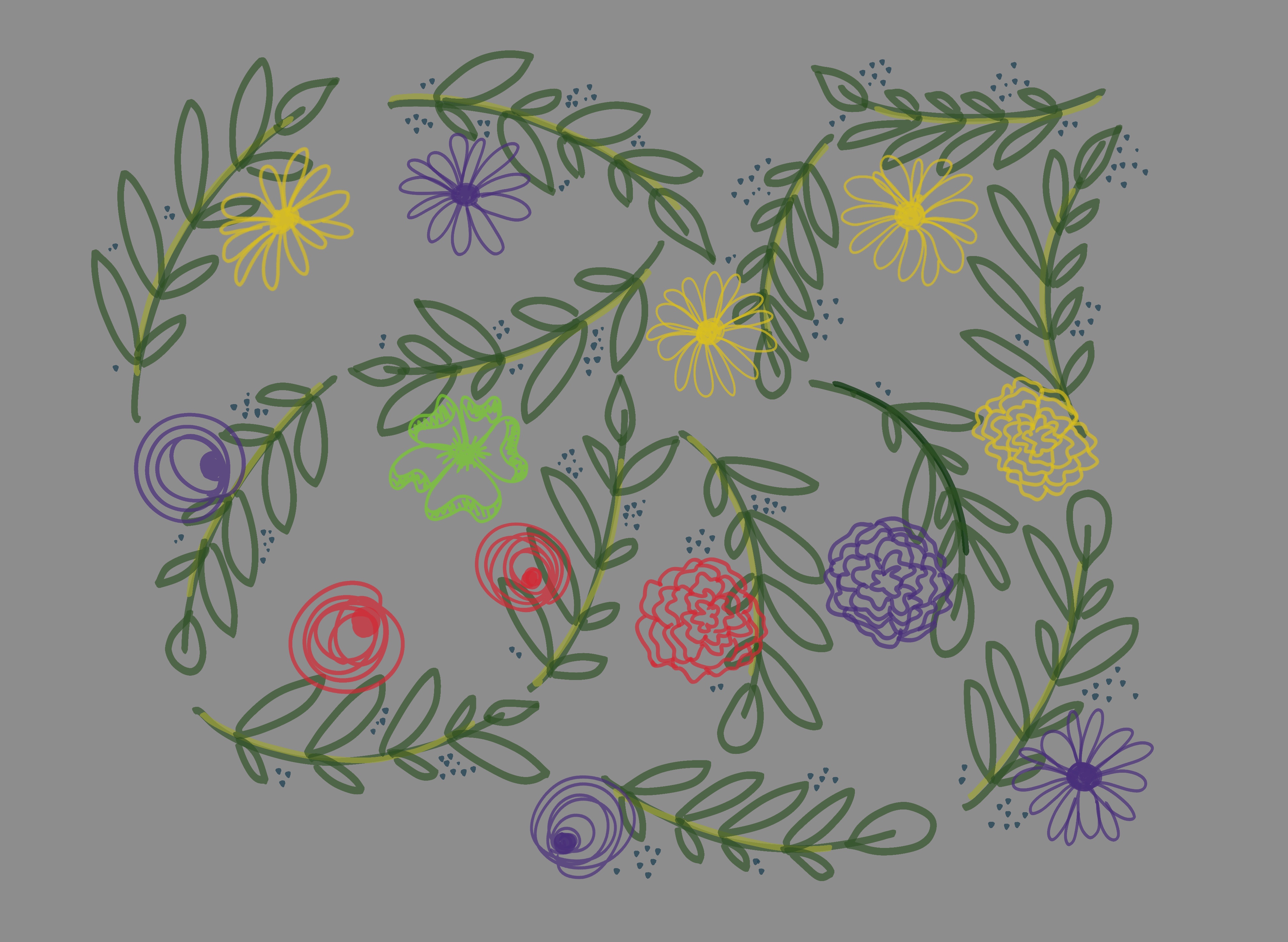
- In honor of Mother’s Day, I surveyed my mother’s friends and family to understand how others see and interact with her.
- Data collected were analyzed and visualized into a floral design to celebrate the unique person my mother is.
- Visualization is hand-drawn using Procreate.
- See the flowers
Creative technology, applied to marketing
My current team at Wunderman Thompson, the Global Creative Data Group, isn’t easily squished into a box. By title, my primary job as a data scientist means I wrangle a lot of data, build backend apps, and write documentation. But as an interdisciplinary team, we collaborate often and affectionately call ourselves the “misfit toys.” We are the ones whose job titles don’t exactly describe what we do, but together we are creative technologists, pushing the bounds of what’s typical or expected of any of our individual disciplines.
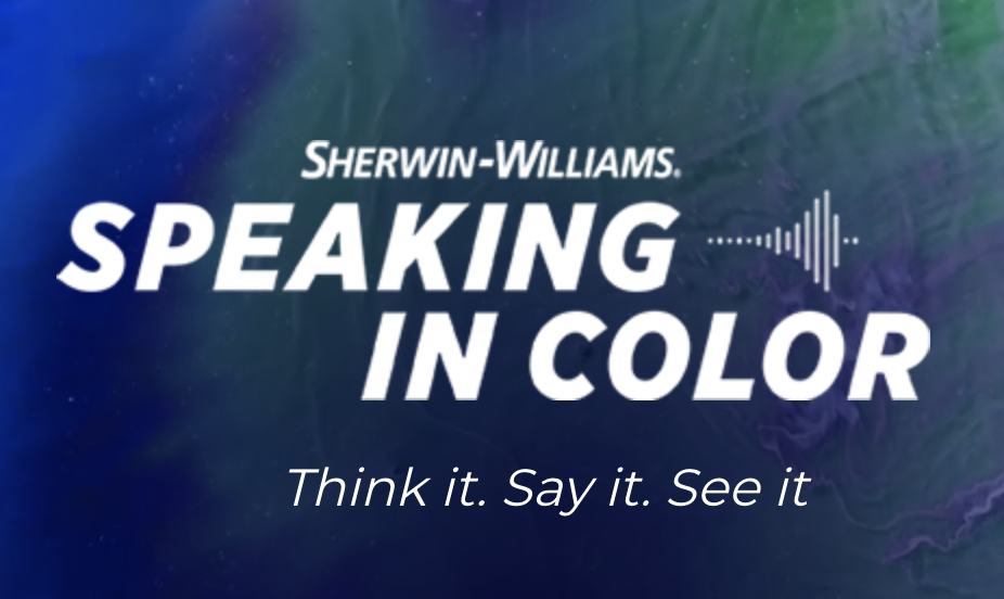
Sherwin-Williams: Speaking in Color
- An app that converts language to colors to data and back again.
- 2022 Cannes Lions Winner: Creative B2B (Grand Prix, Silver) & Digital Craft (Bronze)
- Project contributions: Built backend app; designed color algorithm to translate colors and adjustments to formulas; implemented site analytics; creative ideation
- Skills & tools used: Python, Flask, Google tools (Cloud & Analytics)
- Try out Speaking in Color
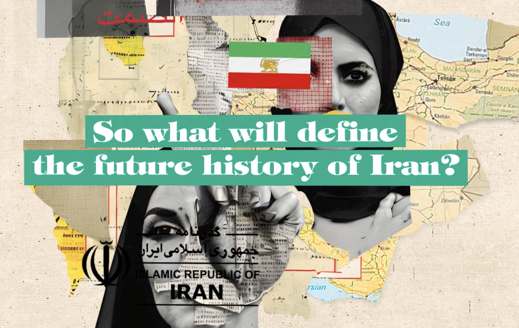
Iran Democracy Council: AIran
- A history book from the future, written by AI, that tells the dire future of women’s rights in Iran if we don’t do anything today to make a change.
- Created in partnership with the Iran Democracy Council.
- Project contributions: Built backend app; researched, wrote, and validated prompts to generate AI book content; web development; data visualization; creative ideation; project scoping
- Skills & tools used: Python, Flask, JavaScript, OpenAI API, Google tools (Cloud & Analytics)
- Try out AIran

Hungerstation: Subconscious Order
- Tap into your subconscious to find out what you’re really in the mood to eat.
- 2023 Dubai Lynx Winner: Mobile (Grand Prix) and Digital (Silver)
- 2023 Cannes Lions Winner: Creative Commerce (Grand Prix)
- Project contributions: Designed decision algorithm for dish selection; built backend app; implemented Google analytics
- Skills & tools used: Python, Flask, Google tools (Cloud & Analytics)
- Try out Subconscious Order