Quarto for Data Validation & collaboration
- Data wrangling, quality-control, visualization; team collaboration; automation; R; Quarto
- Quarto document that renders notes, questions, and tables for checking data quality and categorization (client had notoriously unreliable data)
- Render to Word document for collaborative purposes- easier to share and comment on (especially with people who didn’t code); I could gather all the feedback in one document, then incorporate it back into my data/code
- Data tables/code repurposed for final report: tables could be replicated and formatted once via code, then copy/pasted to final slides. I considered rendering to slides directly, but Quarto’s support to PowerPoint slides isn’t as good currently, especially for highly customized slides like we had. Given how many other people touched them, the reports weren’t at a place to be fully automated quite yet, despite how much I wanted to automate the whole process because it was very manual.
- Live Quarto document
- GitHub repository (includes Quarto doc and R script to generate fake data)
Manneken Pis: Oddball Data Visualization
- Data collection, wrangling, and visualization; proof-of-concept prototype vs. real project; web scraping and development
- Data did not exist; I assembled the original dataset to see what was available before going deeper to refine the visualizations and questions/analysis
- This is very much a prototype piece, a proof-of-concept data visualization that allows people to poke at *something- and start to form more intelligent questions of where to dig next, what else needs to be collected or cleaned up to build out more of a story
- GitHub repository
- Published Quarto document
Data Portraits @ Work
- Survey design; creative data use; visualization design
- A hand-drawn view of how I see and collect data around me; how data help us connect and understand each other in different ways
- Creative and design-focused since the data aren’t that complicated. Trickiest aspect was figuring out how to represent everything in aesthetically pleasing way without running out of colors (I tried to limit my palette)
- Project was originally shared with data team only, but spread to the broader agency. Sharing with the creative team allowed them to see the data team as more than just number-people (we were creative too!). Also fostered my professional growth as I became someone who people would reach out to with slightly wackier data ideas to see what’s possible
- See more about the portraits + legend
Bruna Tavares: Colorfeel
- Python (Flask) backend & deployment (GCP); frontend (accessibility via screenreader, language & data handling); debugging; documentation; creative ideation; AI prompt refinement
- Note: this was a collaborative project between 6 other people
- A tool to help low- and no-vision people select makeup to fit their skin tone, mood, and style
- Use AI to meticulously craft more compelling color descriptions for makeup shades based on non-visual cues (such as textures, temperatures, flavors, etc.)
- Includes a sighted version of the app, to test how descriptively you can describe a color
- Try out Colorfeel
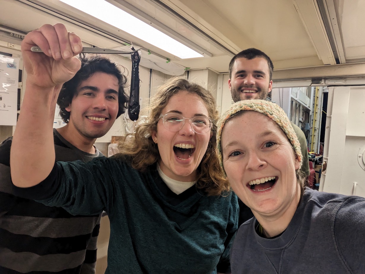
Seabuck: Logs from my month at sea
- Web development (Quarto, Google Analytics); GitHub; communication
- Logs of my month-long adventure at sea: volunteering with a zooplankton group (Décima Lab at UCSD) to collect and pre-process samples
- Proud of: deploying efficiently while at sea (smaller images, GitHub Action, Google analytics to see where audience is); science communication (how to tell a story with humor, science, and intelligence to a varied audience); a time capsule of a very unique time in my life, of trying something totally new
- Logs website
- GitHub repository